The New BaseHubs

Amanda Amadon
Welcome to the new BaseHubs! We’re happy to have you here.
The rebranding process is an exciting time. It is an opportunity to sit down and really pinpoint what your goals are and where your strengths lie. It is a chance to develop the voice that will carry your business’s name for years to come. The launch of our new website is a fantastic display of the hard work that’s gone into creating the new look of BaseHubs.
We know as a company the core values we want to portray. BaseHubs is a business focused on growing connections within military communities and supporting local business. This new website and our overarching brand is designed to be welcoming, energetic, and personable - the same qualities we strive to bring to the communities we work with.
Collaboration is key. Teamwork makes the dream work. Insert whatever cliché best suits your taste here; but it’s the honest truth. Successful design comes from successful communication and collaboration. Graphic design tends to focus on format and visual appeal. Web development tends to focus on functionality and interactivity. Marketing tends to focus on clear message design. All skillsets are necessary to create a successful user experience.
BaseHubs entire website is in the typeface Open Sans. The font’s official website said it best in their headline, “The only font you’ll ever need”. It’s modern, it’s simple, it’s easily readable across all platforms. Open Sans is straightforward without being boring, which is a hard scale to balance. It looks great as an extra bold, bright blue, 45 point headline, and it looks great as regular, simple black, 12 point body copy.
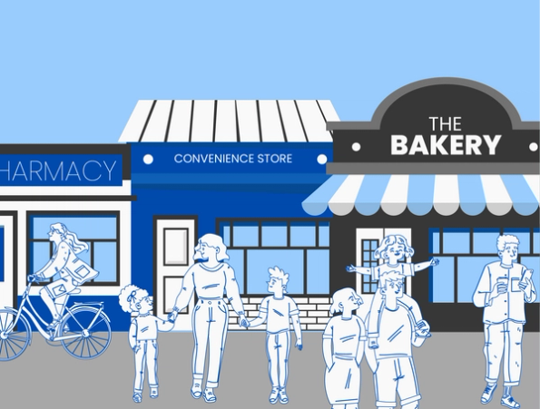
We chose to employ our two signature blue shades from the BaseHubs logo throughout the web design. In color theory, blue is often associated with being reliable, trustworthy, and honest. These colors are utilized in a deliberate manner to highlight headlines and indicate important information. They are paired with simple black and a few grays to provide contrast without overwhelming the design. The combination of these colors creates a feeling of balance; the blues are energetic but grounded, the blacks and grays are concise but interesting.
The new graphics created for this web redesign tell the story of our mission statement; “Live like locals, from day one’. We see depictions of people bouncing around their town, grabbing a coffee at their favorite cafe, stopping by their favorite business to see what’s new, or just puttering down the sidewalk happily. While to many this seems like a pretty mundane experience, ‘living like a local’ is something many military members and their families yearn for, as they oftentimes never live in one place long enough to truly feel comfortable. These graphics are meant to bring excitement and energy into the concept of living like a local.
It is exciting to start the first quarter off with such significant and exciting changes. Everyday we are striving to do better than the last, to be more than we were before. We have new goals on the horizon, and cannot wait so see where the next year takes us.